UI Patterns and Techniques
About Patterns
Whole UI:
Page Layout:
Illustrated Choices
Tables:
Direct Manipulation:
Miscellaneous:
Illustrated Choices
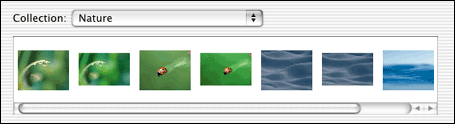
From the Mac OS X system preferences | |
|
The UI presents a set of choices that differ visually, e.g. colors, font families, or alignment. |
Why: |
Why translate a visual concept into words, when showing it visually is so much more direct? You reduce the cognitive load on the user -- they don't have to think about what "goldenrod" or "Garamond" might look like -- while simultaneously making the interface more attractive. (Hopefully.) |
How: |
Each thumbnail (or color swatch or whatever) should be
accurate, first and foremost. What the user sees on the
illustrated choice should be what they get. Beyond that, show the
differences that matter, and little else; there's no need
for perfect miniature reproductions of the choices' effects. Show
a simplified, streamlined, and exaggerated picture.
These can be used in dropdown lists, radio boxes, scrolled lists, tables, trees, and specialized dialogs like color choosers. Ideally, you can show the user a set of illustrated choices all at once, in one single dropdown or list or toolbar. A user can then compare them to each other immediately and easily. If you show them one at a time -- which sometimes must be the case, as with the Preview pattern -- the user sees them sequentially over time, which isn't as good for comparing one to another. Sometimes it's appropriate to show both the picture and the item's name. If the user would benefit from seeing both of them, do it -- they'll learn to associate the name with the picture, and thus the concept. UIs can teach. If you need custom icons or thumbnail pictures, consider getting a good graphic designer to do the artistic work. Make sure they are sensitive to the visual vocabulary of the whole application, and that they understand what the choices mean. |
Examples: |
|
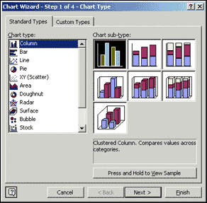
From Excel for Windows
|
|
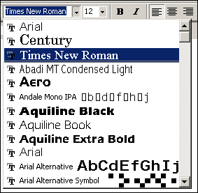
From Word for Windows |
|